Tuesday, 10 May 2011

neurowear

People think that our bodies have limitations,
but just imagine if we had organs that don’t exist,
and could control that new body?
We created new human organs that use a brainwave sensor.
Necomimi is the new communication tool
that augments the human bodies and abilities.
This cat’s ear shaped machine utilizes brainwaves
and expresses your emotional state before you start talking
Just put on Necomimi and if you are concentrating,
this cat’s ear shaped machine will rise.
When you are relaxed, your new ears lie down.
If you are concentrating and relaxing at the same time,
your new ears will rise and actively move.
In general, professional sports players demonstrate this ability the most.
What will happen when people show their feelings
even when they don’t express them?
Interesting? Ashamed? Scared?
In the beginning, people may feel strange,
however people quickly become accustomed to controlling their new ears
with their brainwaves. Right now, Necomimi can become a part of your body.
http://www.youtube.com/watch?v=w06zvM2x_lw&feature=player_embedded&safety_mode=true&persist_safety_mode=1&safe=active
http://www.youtube.com/watch?v=XznibGFPGHk&feature=player_embedded&safety_mode=true&persist_safety_mode=1&safe=active

Saturday, 30 April 2011

Gyaru and Ganguro style


There are a lot of subcultures inside gyaru, like rock, hime, oneegyaru, and so on. Gyaru subculture is still a major influence in the economy with the Japanese fashionbrand branched Gal and become more accessible in rural areas. In Tokyo, more often than not, a shopping center in every major train station that is dedicated to offering the latest and trendy items from popular brands Gal. Some brands are also reaching outoverseas by having their goods easily accessible at WebShop offer shipping service worldwide.


these pictures above are examples of gyaru style

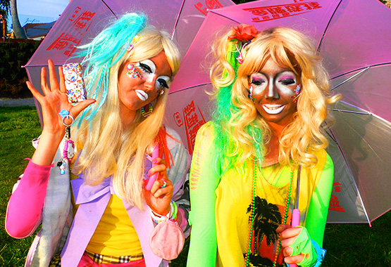
Ganguro is more extreme style. Ganguro, literally “face-black,” is a fashion trend among Japanese girls, an outgrowth of chapatsu hair dyeing. The basic look is bleached-blond hair and a deep tan, produced by tanning beds or makeup. The intent is to produce the tanned, blond California beach girl look. Accessories include high platform shoes or boots, purikura photo stickers, and cellular phones.

 and these are ganguro style, looks kinda creepy XD.
but it's called art "anti beauty".

Friday, 29 April 2011

Believe it OR Not


It might be very hard to believe that the photographer did not use Photoshop to idealize this photograph. She actually  took this picture on a rainy and windy day. I find this photograph very eye catching because of the colours used and the subject was not put in the middle. There are many blue colours on the girls outfit that connects it to the background. The theme "sleeping in heaven" is also very interesting. There is also a contrast between the texture of the sky and texture of the street. The rough and the soft texture are combined and make it look incredible. Finally, the photographer cleverly used the horizontal line on top of the sky to make the subject stand out because of the orderly line and the rough order in the sky.


                                                      (The Horse Turned His head to the other side)
It is a very unbelievable photograph that is taken for fun by the photographer without making up the pose. This is a very tricky photograph and the photographer was definitely  very fortunate to have seen such an interesting pose.


This definitely looks photoshopped but actually it's a life-size photographic work based on the original building in Paris, printed on canvas, enhanced with bas-relief. It shelters the renovation of an Hausmannian building during the year 2007. The project is named"39GeorgeV" is an urban surrealism manifesto.

Tuesday, 26 April 2011

Flat-Pack Furniture ‘Mat’

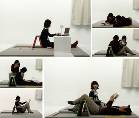
This design idea from Shin Yamashita works just like an area rug or colorless carpet when not otherwise in use – but contains a hidden desk, secret chair and other cool stuff in its flat folds. It is intentionally nondescript – the only decorative touches being splashes of primary colors indicating functional purposes within an otherwise gray field.


No matter how small you make them, most transforming furniture objects end up taking up at least some space in their smallest configuration. Not so with this floor mat – a singular design object that folds flat to the floor but is filled with all kinds of creative surprises.


These days people like something simple and not take up much space. This is very good for a family or individual who only have a small space at home because this mat is highly versatile, ie can be a bed, dining table, study table and backrest. and also it looks very comfortable judge by the look.


Monday, 25 April 2011

Crossword Puzzle Wrapping Paper Works for Any Occasion


The number one problem with wrapping papers: they are typically suited for only one season, holiday or other highly-particular occasion. Compounding the issue: each sheet and roll remains the same from one year to the next.


A cheat sheet is included for those who wish to find a short-cut for a last-minute gift – options include birthdays, congratulations, miss you, love you, Thanksgiving, Valentine’s Day, Christmas, Easter, and the ever-popular: it is not a tie.
I think this wrapping paper is quite interesting. the fun part is (or could be) filling in those blanks – figuring out where the words you want to select are hidden within the puzzle, highlighting or circling them, and making sure they appear where you want them to on the finish-wrapped present in question. Genius, interactive yet modest.
this is good for people who likes to play crosswords puzzle.

Saturday, 23 April 2011

how anime girls would look like in real life @.@

Have you ever wondered what anime girls would look like in real life? CG artist Chris Scarborough does. In fact, he renders realistic portraits of girls with anime features, big eyes and all.


 look at these pictures !! =>


do they look cute, pretty or creepy? LOL


and these are more pictures from other site
i dont think they look cute at all.. 
all i can say is that they look evil or some of the picture look like aliens.

and links below will show some tutorials on how to look like anime

enjoy XD

Friday, 22 April 2011

James Jean

James Jean is one of my favorite artists because most of his art works look really interesting to me.
James Jean was born in Taiwan. Jean is an artist based in Los Angeles, California. He was educated at the School of Visual Arts in New York and has lived in Los Angeles since 2003. In a ceaseless torrent of images, his finely wrought and narrative-driven work has captured the attention of a world-wide audience and the admiration of other artists, designers, and filmmakers. Renowned for his draftsmanship, imagination, and ability to span the commercial and fine art worlds, Jean has created a deeply involved body of work that has been widely featured in print, fabric, large-scale installations, and animation.

Virgin. Acrylic & Oil on Canvas, 60 x 52", 2010
James Jean describes virgin as quiet, hidden, loneliness, sadness and mysterious.

this is his art work in 2011, it's called :
Lotus War S/S Color. Digital and Ink on Silk, 36 x 36", Edition of 50, 2011. Produced by OVM

his art work in 2010 looks colorless which is very different from  his art work in 2011.
  

Tuesday, 19 April 2011

Stackable Patio Furniture Designs


There is something unsightly about most stackable porch and patio furniture designs – cheap plastic that fits functionally, but not aesthetically, together into a single tower. This creative stacked furniture design from Dedon at least creates an object of visual interest, unobtrusive but present, when not used as chairs.

With both larger and smaller versions available, two to four seats along with a coffee table all emerge from a single sphere or obelisk shape. The table alone sets this apart from most transforming/collapsing chair sets, but with the passable style and transforming functional of this set one could also imagine cramped interior spaces benefiting from one of these designs.

Theses designs are very simple and attractive, they are not only work as chairs and table but they can be view as masterpieces too when they are not in used.

Thursday, 14 April 2011

suspended staircase


These seemingly imposible modern stairs seem to slice invisibly into the wall – an effect enhanced by the color and reflectivity contrast between the glossy black steps and the matte white wall

This staircase is as much a work of art or sculptural centerpiece as it is an interior design element. Cast against the light wood floors, white walls and ceiling the stairs stand out at all angles – a mass of bending and twisting angular metal unlike any spiral staircases you have ever seen. Designed by Thomas Laurens, these metal stairs are sure to be the talk of any dinner party – especially when someone gets stabbed by them.


Look closely: the single-piece set of stairs and treads twists from bottom to top without ever touching the adjacent walls or the central pole that serves as a handrail, being fully self-supported along the way.

No railings or risers, just sheets of straight modern glass on other side – but strong enough to support floating wood treads and the weight of people walking up and down them. Load-bearing glass is not new, but using them for residential interior spaces is striking.
These staircase are really cool. because they look so simple and don't take so much space.

Wednesday, 13 April 2011

Blck anf white picture


In her legendary photos Toni Frissell impresses with a strong trend toward surrealismor realism. Images are presented below, albeit in black and white, are both very sharpand clear. To achieve such level of clarity in black and white is very hard.
xtremely hard.

Black and white pictues are really interesting. because we can feel some touch of feeling with the picture. colourful picture considered as a happy mood. Black and white picture shows romantic, depressed, lonliness feelings. if you take a colour photograph and change it to black and white the feeling will slightly change only because you change the colours.

Thursday, 7 April 2011

The EGO VS Ferry


The EGO, the world’s first compact semi submarine, itscockpit is located below the floating hull so while cruising about you always have a lovely view of what lies below. The windows of the EGO are made of special acrylic materials, mostly used in aquariums to withstand water pressure and enable light transmission for better visibility. It features a top speed of 4 knots for 4 hours, and it runs for 6-10 hours on a single charge. Other equipment includes a monitoring LCD system, battery monitoring systems, VHF marine two way radio, digital depth gauge, foot pedal, compass and clock

I think this is a fabulous transfortasion because you can see inside the sea and above it. it's really enjoyable.
it's almost the same compared to Ferry, but the good thing about EGO is the size. Eventhough, it can't fit large size of people. EGO more into family transportation. and Ferry more in high class comunity.

Friday, 25 March 2011

street art


As we see these street art are really awesome. these people are born with good talents.
judging from the picture.. these paintings look real. i think this is kinda sad because they can only express their art work on the street using chalks and on a rainy days everything are disappeared.
i think those people who drew these should have their own gallery to show their art works to others and they can keep them forever.


Thursday, 24 March 2011

make up and without make up..


In the picture we can see two different faces which is owned by one person.
now-days people are so easily deceived. many men seeking for a beautiful woman via the Internet or fb. as you can see the make up and photoshop can deceive people. we can't even tell that they are the same girl.
many girls feel insecure about their appearance, they do not feel confident without makeup.
I think this is not good because people only care about how they look from outside but they do not care about their inside beauty.

Muhammad Ali Sculpture Made of 1,300 Speed Bags


"using 1,300 punching bags, 6.5 miles of stainless steel cable, and 2,500 pounds of aluminum pipe to construct a 22-foot-high installation that took three years to complete" By artist Michael Kalish.
"The idea for the project came to Kalish as he was falling asleep one night in 2008: an array of custom-made, teardrop-shaped speed bags suspended in midair that, from just one vantage point, align themselves like pixels into an image of Ali's face."


This is a really interesting art work as you can see..
A good artist can turn anything into a nice art.
I really like it.. at the other side you can't even tell what it is.. 
but when you see it from the front it's actually Ali's face.
don't you think that Michael Kalish is very creative?

Monday, 21 March 2011

tattoo = art

I think tattoo is really attractive, but depends on the design and where you put it.. as well, tattoo can describe the person characteristic.
like this tattoo make us think that the person is mysterious and attractive at the same time.
I really like the tattoo itself and the location of the tattoo..it looks really attractive.
I think tattoo is one of the best work of art.

Children's drawings made into reality


Korean artist Yeondoo Yung on Designboom thought it was such a good idea. He recreates children’s drawings and makes them into real life scenes, but in this actually creates some really interesting compositions, use of scale and colour. According to the article on Designboom, he collected over 1000 drawings by children aged 5-7, and a select few were turned into reality in a series of photos called ‘Wonderland’.


This picture is very interesting because they turn a kid's drawing into a real photograph. It shows that everything that people draw are exist in real life. most drawing or painting has meaning either connect to the person who draw/paint the picture or they have seen it somewhere and caught their interest.

Tuesday, 22 February 2011

hairstyle from the past to the future.

1970s hairstyle

2010 hairstyle

The first picture shows the hair style of 1970 and the second picture shows the style of 2010s hair. as we see them not
much different in style, especially their bangs looks the same. These photographs tell us that people bring 1970s hair style
into this new era (2010). people have limited creativity, that's why they reuse the same style over and over again.